Digital Literacies with Hallie


|
As social media grows and more and more people—especially celebrities—use it as a way to get their voice heard, some people are misunderstood or take it too far. My experience with social media, even though I am only on three of the many, have been linked to what is popular with the news and it seems like the common platform is Twitter. My example of miscommunication through social media stems from the Twitter comment of Roseanne Barr to Valerie Jarrett (former Obama White House adviser). Roseanne's tweet, which is included in the picture below, was a racist joke about Valerie Jarrett. Just like Justine Sacco’s joke about AIDS and race from “So You’ve Been Publicly Shamed” that did not mean to offend so many people because she thought it was harmless, doesn’t mean it wasn't. Both women ended up losing their jobs and being well-known for something awful and tasteless. They also both started with a joke that was meant to be directed at such a small audience who would actually think those types of things were funny. When someone is posting a joke on a social media platform, they must think about all of their intended audience because it only takes one person to bring attention to the ignorance that is in the “joke”. Roseanne’s audience was basically everyone who was following her and everyone who was following Valerie Jarrett since she tagged her in it. Because Valerie was tagged in her post, the backlash from her following group played a major factor in the audience makeup of who would respond. The author of the tweet thought the genre was going to be placed into a comical category and would appeal to people who enjoyed a joke, but she didn’t think about how racist and not funny such a remark was. The author (Roseanne Barr) is a well-known comedian with a sitcom show, so she assumed that since she was a comedian it was alright to make a remark in a “joking” manner. However, the comment was not put in the comical genre but was placed into the offensive genre since it was so tasteless to so many people. Her purpose in making the joke was to make fun of someone who she thought would get the joke, but ultimately, it ended up ruining her career and getting her show cancelled. As far as a solution goes, I don’t think there is one at this point because people are going to say what they are going to say. It is a right of theirs to voice whatever they feel and that might not all be good sometimes, especially in this case. On the other hand, I do believe there is room for redemption. Both women had tried to apologize in sincere attempts and were denied forgiveness by the public, but I think its human to make mistakes and also human to forgive which I think that is the solution to our miscommunication or even bad judgement. However, in this digital world everything can be blown out of context, so even when you think you are being careful, another person will take your comment completely different than who you intended to see it. 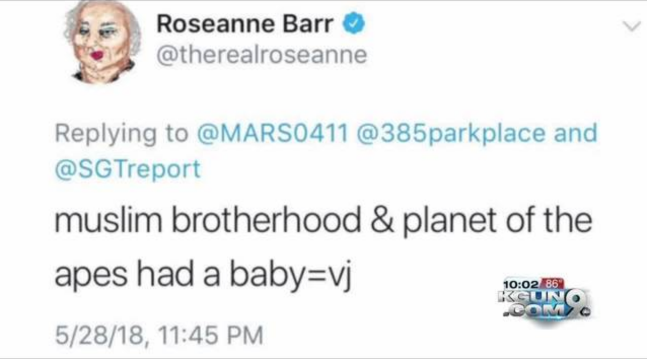
2 Comments
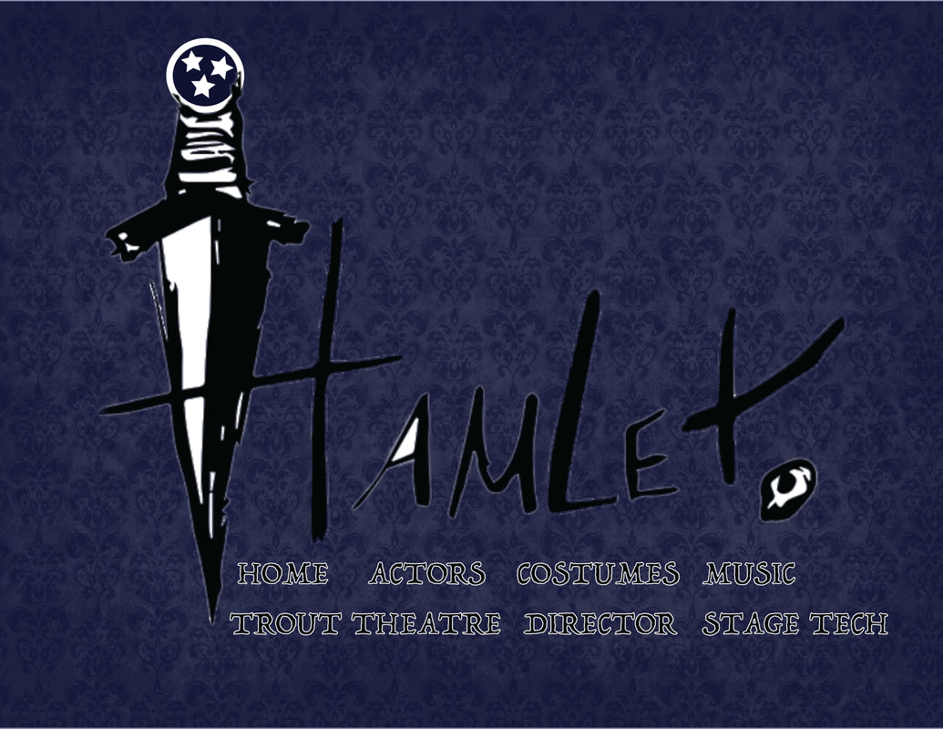 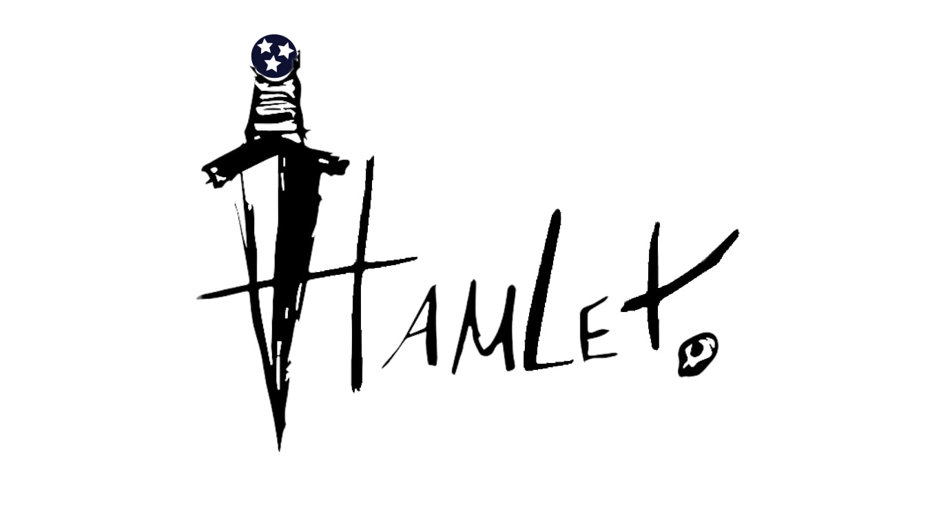 For my website design, I wanted to focus on Nashville and the original Hamlet elements. Because it is Hamlet, I wanted the color scheme to reflect both the dark undertones of the story and the colors/light choices/costumes of the performance. In our discussion on Monday when Dr. McDonald was available to answer questions, she mentioned that the play was mainly in a blue color scheme and used the contrasting colors of yellows and oranges. I decided to emphasize the blue and use contrasting black and white, rather than the yellow because it was a visual distraction when I put it in the web mock-up. As far as organization and alignment go, I wanted the title of "Hamlet" to be centralized and larger than the menu bar because I thought it should be the main focal point of the piece. The menu bar was then placed in the section below the title and contrasted in the black and white so that the color scheme remained constant. The last design element would be proximity, and I wanted to evenly space out the menu bar but put it close to the title so that underneath the focal point, was the easily accessible menu bar. The targeted audience that I was aiming to reach was the Shakespeare goers of Nashville. My purpose was to target mainly Nashville Shakespeare enthusiasts, so I decided to place the Tennessee circle of stars in the dagger of the “H” to customize it to the Nashville area. I had also wanted to capture the attention of other Shakespeare enthusiasts by using the well-known elements such as the dagger and the skull. I think by keeping the color-scheme dark and regarding the disturbing context of the play, the colors went well with the dark-themed elements and relayed the over-arching message of gloom and loss.
For my introductory website, I made the challenging and fun decision to start from scratch with the basic HTML coding tutorial we did in class. With that being said, I completely changed everything on the code and tailored it to a format of my liking. I wanted the design of my personal website to be simple and professional-looking while still expressing my style and creativity. As I started the coding process, I had a clear vision of what I wanted: white background with script text, a centered navigation bar, and my logo centered at the top of the page. Since my vision was so specific, I found it difficult to figure out the exact coding and styles without using a template but rewarding when I continuously tried over and over again until I was successful. Along with finding the specific coding I wanted, I had difficulty figuring out how to place the images without having to move the text in the footer. Every time I would move the images, it would skew the footer over to the left and I finally figured out that I needed to add padding to html code with an internal style sheet and not an external CSS style.
In addition, I could not get the h2 text to change the font family and then I realized I did not need the dash in the type of font I used when I was changing the style sheet; it’s amazing how little details in the code can throw off everything and change things you did not mean to change. However, with all of the challenges that were thrown my way, I believe I was able to achieve the simple website I had wanted. The only thing that was different from how I had envisioned my website, was that the layout was slightly off from the organized, grid pattern I had hoped for, but I was pleasantly surprised with the staggered photo grid that I used instead. Overall, I feel that the layout—even though it wasn’t exactly what I wanted—turned out better than I thought and even though it is staggered, it was still organized. It is sufficient for a basic and beginner website but if I was to have a vast knowledge about coding, I would love to have a complex and interactive website that had special sidebars and navigation lists. I would use more colors and have my logo strategically placed throughout the website and possibly set up an online store where I could sell my designs. I think it would be fun to understand what coding to place where and exactly how to do everything. In terms of modes, I started off with the most natural one to me: linguistic. Linguistic mode is a mode that refers to the use of language—whether it be spoken or written—and as an English major I know that the importance of getting my point across in a quick manner, is one that is valued. For my website, I really wanted to focus on description of who I am and introducing that in an easy-to-grasp way. I organized my text in a way that was right in the center of the page, so it was easily seen, read, and developed into the bigger picture which brings me to the next modes used in my website: Visual and Spatial. Visual and Spatial modes are definitely at the top of the list if one wants to gain attention from the audience members, and as a graphic design minor I want my audience to notice the work I do through the designed placement and be attracted to it. For example, I chose simples colors and styles like pink, black, and white because I wanted the color choice to reflect me as a person and the vibe that I wanted to give off. Layout, size, perspective, and framing all branch off of one another because one depends on the others to look good and cohesive. These design aspects played a major role in my choices because I wanted to lay out the website where everything was accessible and could easily be navigated from page-to-page. I used bits of framing throughout the images by putting them in a central location on each page and made sure my main logo was always at the top and in the center. For this specific website I did not use any form of aural mode (since there isn’t any sound) and limited gestural modes, such as the facial expressions to promote a positive image through pictures of laughter and friendship; these establish a virtual connection to the audience that conveys a friendly atmosphere. Finally, in terms of design strategies, I followed the basic outline of a rhetorical situation as outlined in our Writer/Designer book: who is the intended audience, what is the purpose, and what is the context? For audience, I determined that the main group of people I was going to be reaching was my classroom, where like-minded individuals were doing the same thing I was. We all have an understanding of what basic HTML code and CSS should look like and we are assessing each other based on these same principles. My audience also consisted of my peers who are going to get to know me through my website and in order to communicate that, I had to pick and choose the best aspects and images that connect to my personality. The purpose of this introductory website was to accomplish the task of a “getting to know you” page or in other words a website that is simple yet detailed about who the person is and what their interests are. The last piece of the analysis is the context which can be seen as something quite broad, but in terms of our classroom setting it is used as an educational device. Specifically, we are all getting to know each other better in an online context and while doing so, we are learning how to be present online through building a website to communicate our thoughts and ideas efficiently. We then can focus on each other’s designs, why they chose that particular design, and how it comes across in the digitally literate world. At first glance, the Royal Shakespeare Company website catches the eye of the reader with its vivid use of red against a contrasted white background and contrasted yellow against different shades of gray. Its highly contrasted design concept captures its main headlines and features of what performances are taking place in the near future. To analyze the webpage in a rhetorical situation is to narrow it down to its audience(s), context, purpose, author, and genre. These categories help to visualize who the website is talking to and what its message is. For example, the targeted audience is someone who is looking for Shakespeare performances in the United Kingdom (and the traveling troupe that goes to the U.S.) or someone who is looking to learn or even apply for a job/ role in the Royal Shakespeare Company. The intended audience can find the seasonal performance calendar, how to get to the theater, and even local restaurants around the performances. Since their marketing is online, it can also reach a modern and younger audience. The second and next category is the context. The website’s context is quite broad because, again, it is online and very up-to-date, so it can reach a variety of people all across the world. They can access this website on any device and read it on-the-go, which makes it the perfect type of advertisement in this fast-paced society. The third part of the rhetorical situation is the purpose behind all of this, which is crucial to affective advertisement and getting the news out about the Shakespeare performances. The primary purpose is to sell tickets to the different shows, donate to the Company, and to make people aware of what it is that the members do. These particular primary purposes are presented through bold words that say, “Purchase Tickets Now” or “Donate Now” and are highlighted in red or yellow (this is where the contrast and emphasis of color come in play). Secondary purposes are that the website serves as an academic resource, reinforces season ticket holder’s/member’s opinions of the Company, and job openings that need to be filled. While secondary purpose is not as obvious as the primary, it still plays a big role in the audiences of what the website is used for. Keeping that in mind, the author(s) of the website took into account everyone who would potentially visit their site and looking at all the information provided, I believe that the author is the entire Royal Shakespeare company as a whole and not just one person; based on the pictures, articles, and event planning, it seems like a lot for just one person to do. Each section is organized into categories which were probably done by different authors and groups of the Royal Shakespeare Company and put it into a genre that is mostly informative and design oriented. Examples of these genres and categories include student resources, job opportunities, photos, and more. The design concept is organized by grids and columns that separate information that goes together and that seems to be done by the web designer, which can be another author (just not the typical one we all think of). After analyzing the different aspects of this website, I believe it was a very well thought out and organized end product. The layout of the page seems very effective in presenting the different material, while still being professional in the display. I especially loved the contrasted red and yellow against the duller gray and white colors to put emphasis on the most important aspects of the site. Going into the website projects I think using this as a reference site, in terms of neatness and effectiveness, is a very good resource to fall back on. I also believe the site creators/designers had a very clear vision of what they wanted and stuck to a cohesive color scheme and grid pattern. Link to the RSC: https://www.rsc.org.uk/ 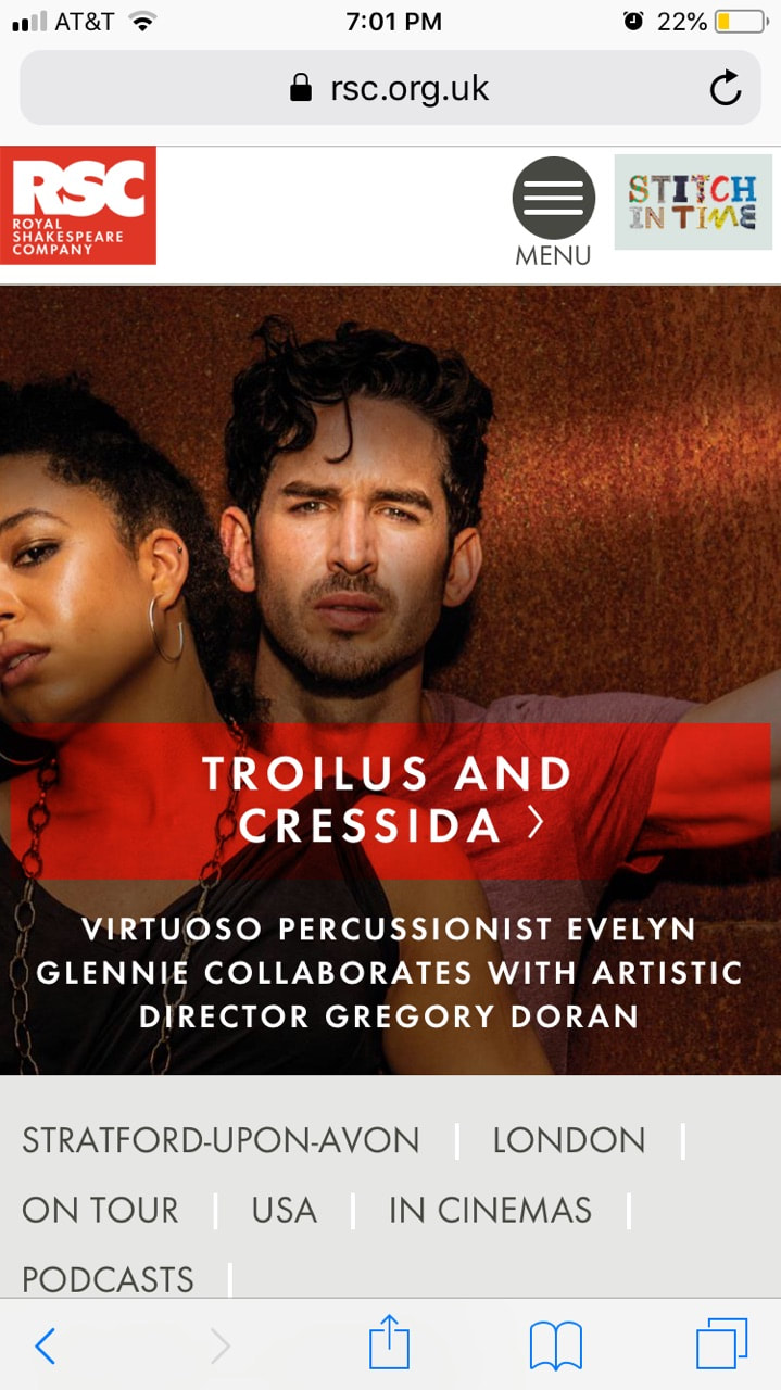 In our world today, being online comes with so many things you have to think of before you post something. Our curation comes from thoughts of how a picture will be received, will everyone like my posts, does it go with the aesthetic of my page, and so on. Being on social media comes with the role of digital curator because in our digital world, one must be careful with everything they do. For example, posting a picture of yourself on Snapchat, Instagram, Facebook etc. has to be done so carefully because you risk the chance that some random person might shame you, post dirty comments, or even unfollow. We tend to follow unspoken/unconscious guidelines of what is deemed acceptable and “post-worthy.” I see my social media as a collection of photos and posts that help people see who I am as a person, but I don’t let it define me— to me there is a difference between the two; social media serves as a window to who you are as a person, but it lacks the personal connection. You never know who someone truly is unless you experience the real-life version. Another thought that comes into my head—when I’m using my social media, curating an image of who I am, and selecting photos for Instagram or Snapchat—is that my future boss or someone who is potentially going to hire me will see the things I have posted in the past. The thought keeps my curation of photos, tags, and things I save, professional and appropriate while still having fun with what I’m posting. As a part of selecting aspects of my social media and digital life, I have also made the choice to set all of my accounts as private so certain people cannot view my page/playlists on Spotify/email whenever they want. I made this choice because I wanted the privacy and freedom to post things that only friends, and some family could see because I trust them to be safe with my accounts. The darker side of technology is that everyone has access to everything all the time and the privacy settings give me piece of mind unless someone goes through the trouble of hacking my account, which is pointless since there is nothing to use that is worthwhile besides pictures of my friends and family. The last couple of things I would like to say about digital curation is that we all participate—whether we want to or not— in a world where technology is a staple and to survive in a career field we must all be somewhat digitally literate. So, that being said, we all are curators of an image for the digital age. The advancement of technology is so fast paced and is always changing that we are forced to stay digitally literate and produce the image of an age of Facebookers, Instagrammers, Snapchatters, and whatever else will be popular in the time to come. As the age of technology, I and everyone around the world has no choice but to curate the digital world.  |
Hallie Becker: AuthorH! My name is Hallie and I'm an English Writing major and a Graphic Design minor from Chicago, IL. ArchivesCategories |
 RSS Feed
